
How to Mix Patterns Like a Designer (Without the Guesswork)
Taking the guesswork out of mixing patterns with an easy formula, classic combos, tips and more
Penny Morrison
Pattern is one of the best tools in interior design for adding character to a room, making it feel unique and special. Just a touch of a single pattern can make a difference (or at the extreme pattern drenching, covering a room in the same pattern), but pattern mixing — the art of combining different prints, colors, and textures — is the key to creating richly layered rooms that look effortless and feel like they’ve been there forever.
Understandably, the thought of pattern mixing might be overwhelming to you. No worries, I’ve been there myself and gotten over the hump, and now I have a home that’s rich in pattern. I’m going to share the simple rules that take the guesswork out of mixing patterns in interior design. I’ll provide an easy-to-follow pattern mixing formula, examples of classic pattern combos, and lots of inspiration from real homes including my own. So, let’s get to it…
A curated guide to creating a one-of-a-kind home: interior inspiration, styling tips, & unique objects
FOLLOW ALONGRELATED ARTICLESWhere to Stay in England: The Best Design Hotels & More
sense of spen• cer
noun [sɛns, əv, ˈspɛnsər]
Reflecting one’s identity through their interiors
A home with character and soul
When a house becomes a home
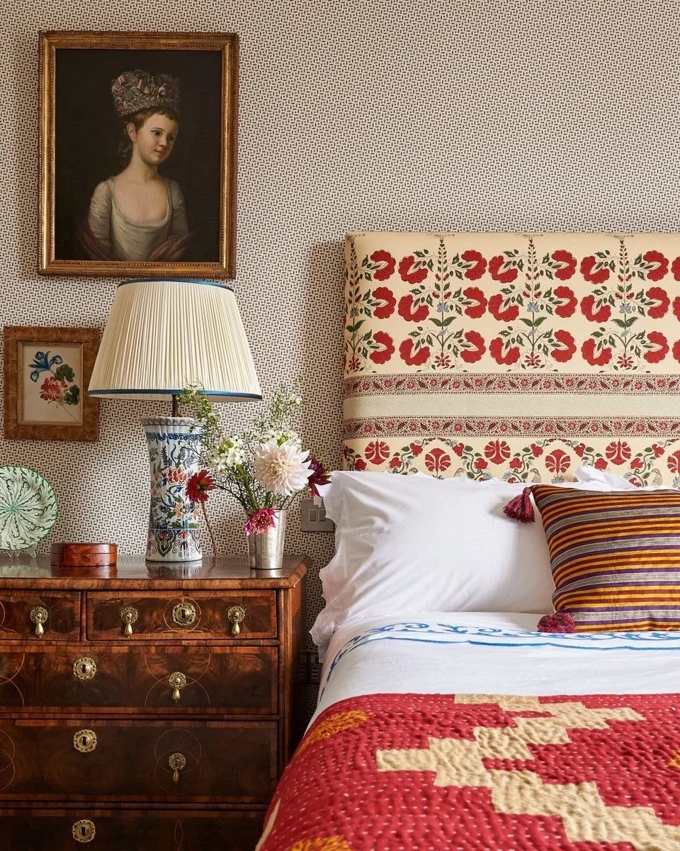
The Pattern Mixing Formula
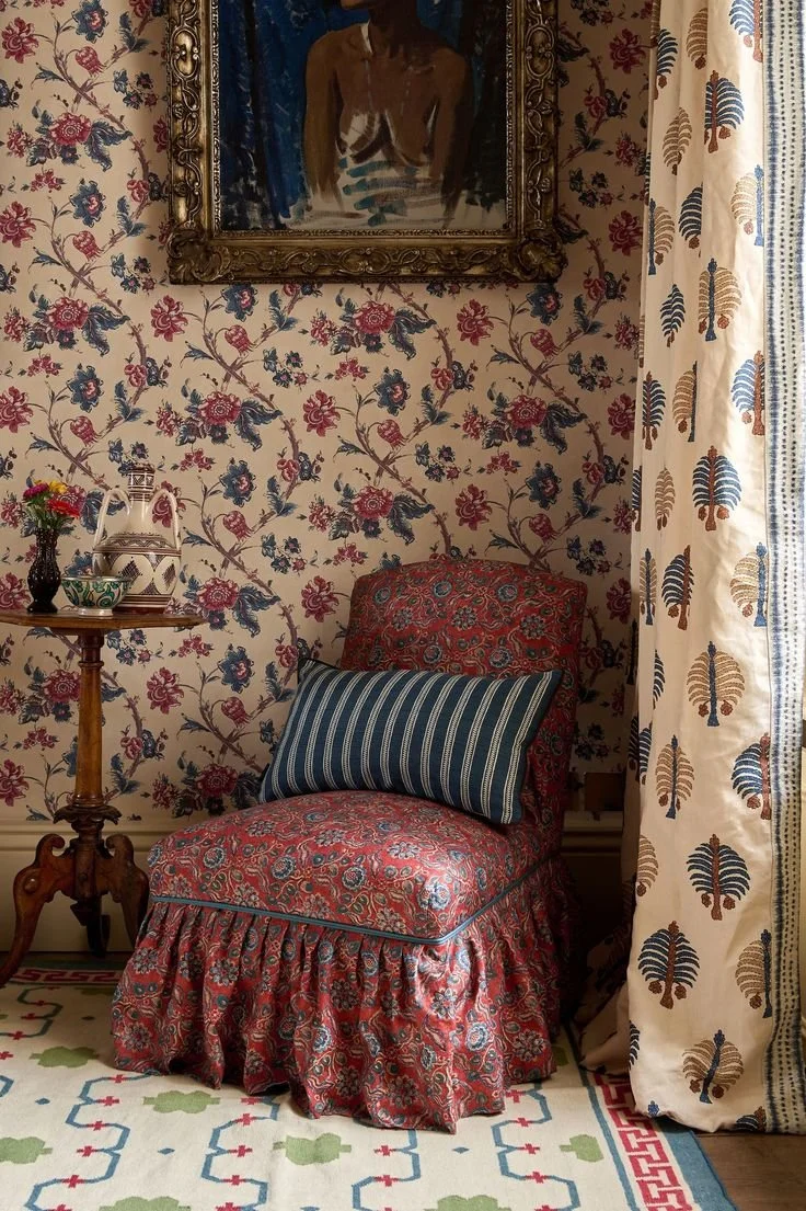
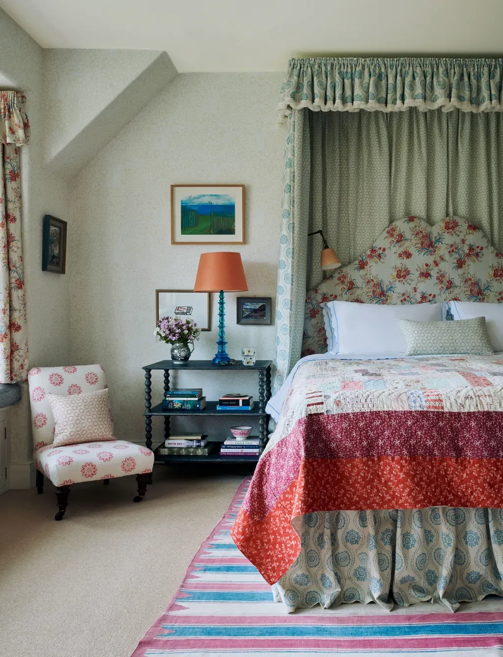
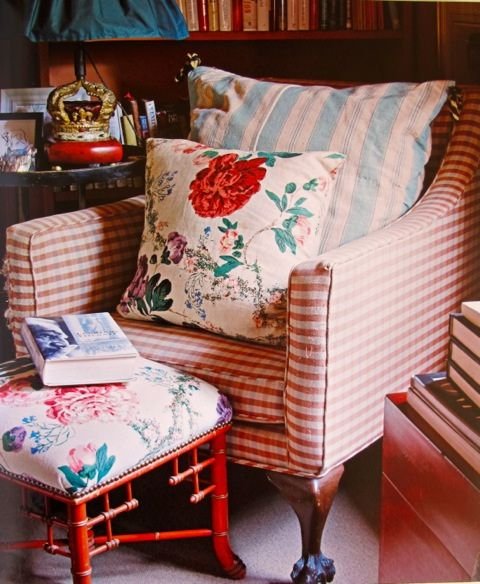
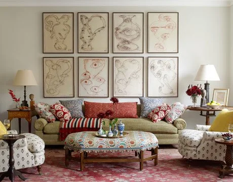
Successful pattern mixing relies on contrasts and commonalities. Contrasting scales (large, medium, small) and shapes (structured prints, like stripes, checks, geometric, paired with organic ones, like florals, paisleys, toile) creates harmony because they each play different roles and don’t fight with one another. Sharing a common color palette can further unify them.
Balancing scale (and shapes)
In general, when mixing patterns, choose different scales:
one large-scale - eg: cabana stripes, suzani
one medium widely spaced - eg: ikat, chintz
one small, densely packed - eg: small gingham, ticking stripe, geometric stars, ditsy florals
As you play around with combinations of different scales, make sure you have a mix of organic and geometric shapes represented. There are truly endless possibilities, so there is no right answer. Have fun with it!
Designed by Sue Johnson Interiors
The "anchor pattern" concept
If you’re looking for a place to start, choose one dominant, bold pattern as the anchor for the pattern combination – such as a rug, bedspread, or single throw pillow. A good rule of thumb is choosing an anchor pattern with a mix of colors and using that to establish the color palette for the pattern combination. Then, you can begin to layer the anchor pattern with contrasting medium and small scale patterns, ensuring each pattern shares at least one or two colors with the anchor.
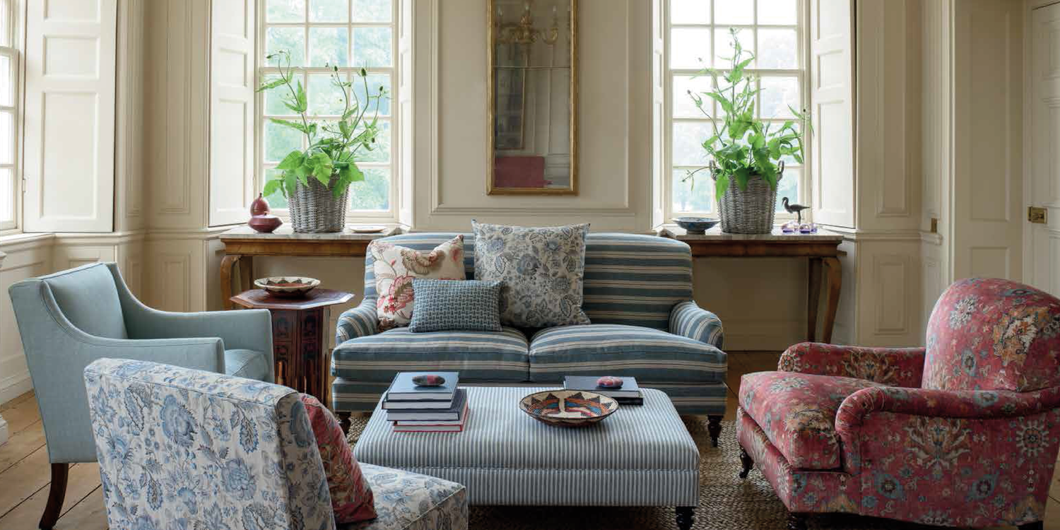
Pattern Types That Always Work Together
Ok, now let’s get a little more concrete. I’m going to get into specific patterns and how to use them.
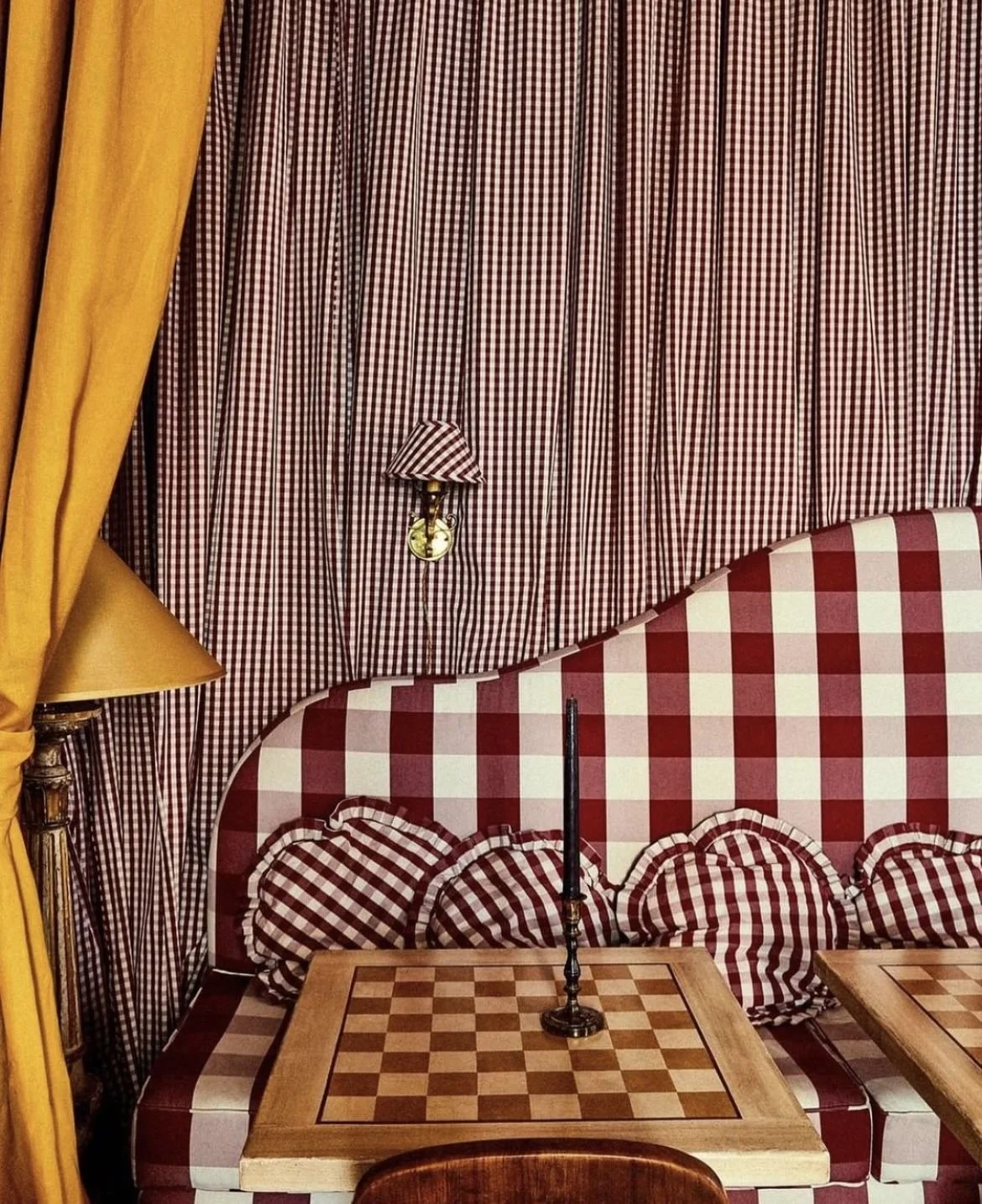
Stripes are the MVP of pattern mixing — they look great with almost any other pattern and in fact can help blend them together. Stripes also look great with other stripes so long as it’s mixing a bold stripe with a small detailed stripe.
Checks/gingham function similarly to stripes — you can pair them with almost anything. Again, you can mix the scale of checks to create contrast.
Small-scale prints act as "blenders" or “glue”, helping to bring together busier prints. For instance, you might find a small-scale print used as a lining of a curtain or on the backing of an upholstered chair. Some examples include: ditzy florals, soft stripes, tiny polka dots, and small geometric designs.
Solid colors (including solids with a bit of texture or details like damask/brocade) are always useful for mixing with patterns to provide a place for the eye to rest.
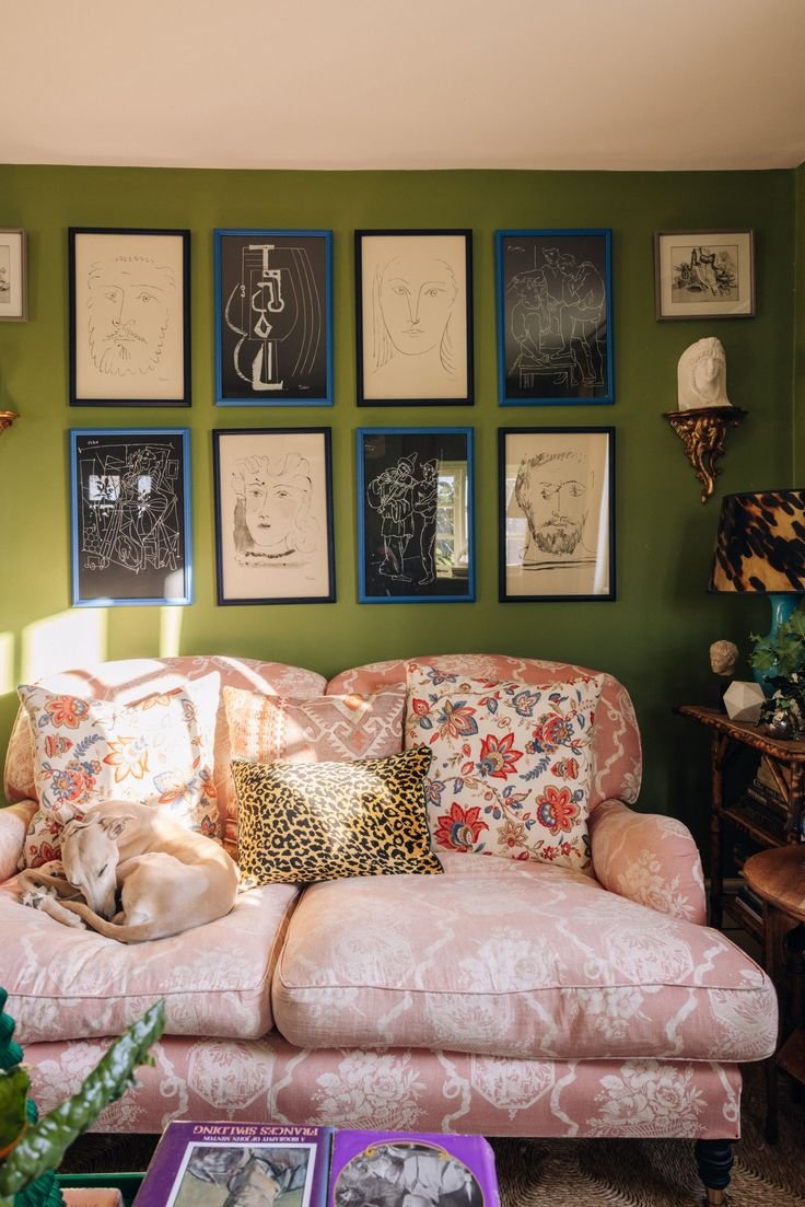
Animal print is universal and can mix with almost any combo of patterns.
Floral prints are versatile and can be used as a big or small scale. For instance, pair a big bold floral print with a detailed geometric print or a medium-sized stripe. Or mix a large geometric print with a small floral pattern.
Bold, large-scale prints, like suzani or chinoiserie, work well as an anchor pattern.
Luke Esward Hall and Duncan Campbell’s home
Design by Sarah Vanrenen
Nicky Haslam’s home
Home of Kristin Perers
Where to Start: Easy Pattern Combinations
There are so many ways to apply pattern mixing in your home, but I’d recommend starting in places that are layered and lower commitment as you’re building your confidence and testing out what works. Here are some suggestions…
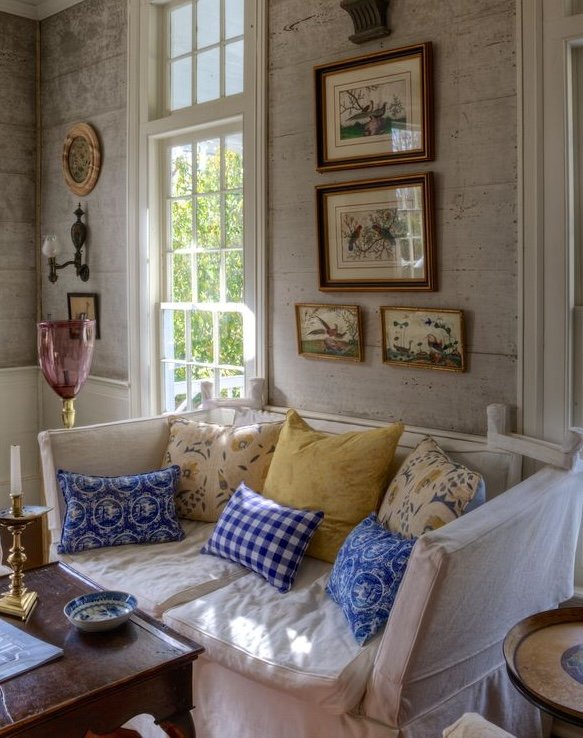
Throw pillows on a sofa
A grouping of throw pillows is the easiest entry point for pattern mixing. Throw pillows allow you to bring patterns into a living space in small doses. In a symmetrical arrangement, put a small and medium scale pattern on two pillows, on either side of the sofa, and a large scale pattern in the center. Alternatively, you can display them more randomly with 1-2 pillows per pattern. Either way, just make sure you mix up the sizes and shapes of the pillows themselves. For more inspiration and specific combos, check out my styling guide to throw pillows.
Design by Daniel Sachs.
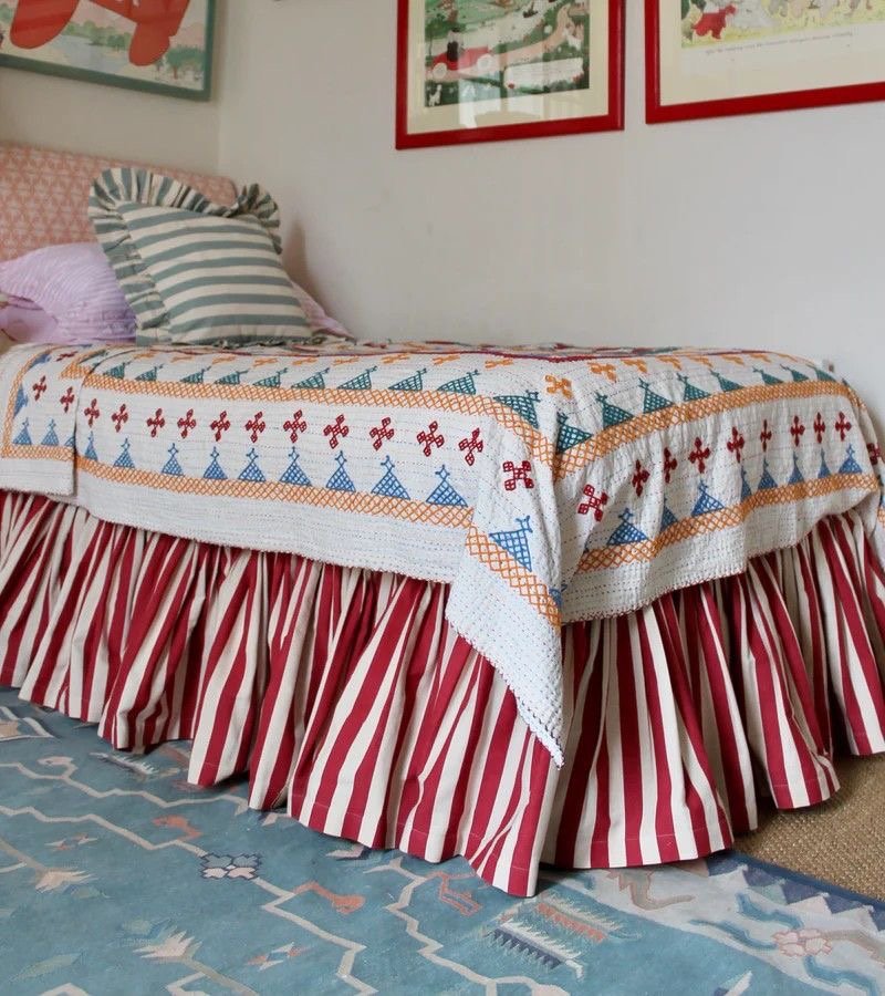
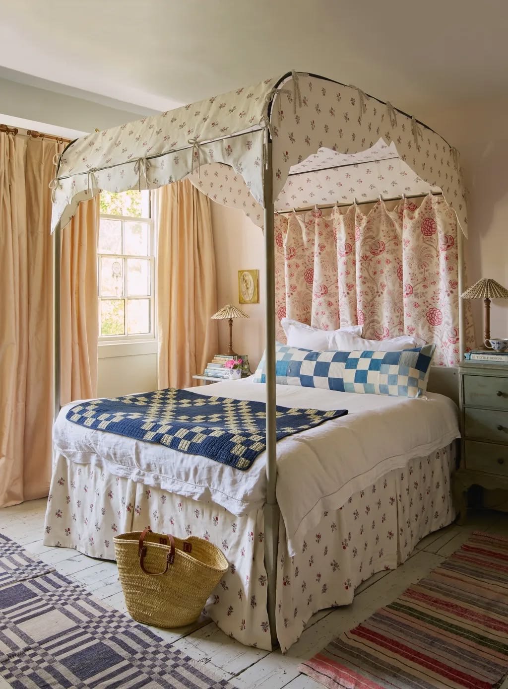
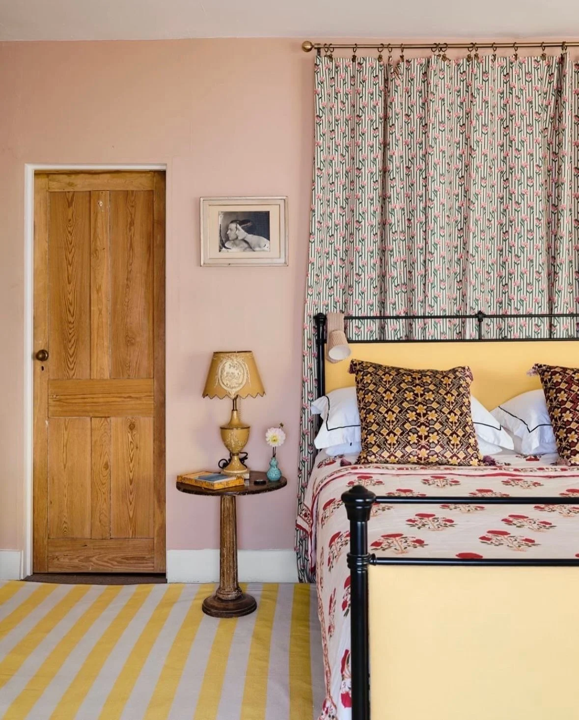
Bedding layers
Although there are fixed places in a bedroom to apply pattern like headboard, bedskirt, wallpaper, and upholstery, I’d recommend starting with layers that can come off/on like throw blanket, accent pillows and area rug beside or under the bed (it can even layer on top of wall to wall carpeting). A pattern grouping in the bedroom is the most flexible as you can change out the layers seasonally (for lighter materials/colors) or depending on your mood (remove pillows or throw blanket for a respite from pattern). Keeping the bedding simple and white provides a neutral backdrop for layering pattern. For more inspiration and specific combos, check out my styling guide to bedroom accents.
Home of Olympia & Ariadne Irving
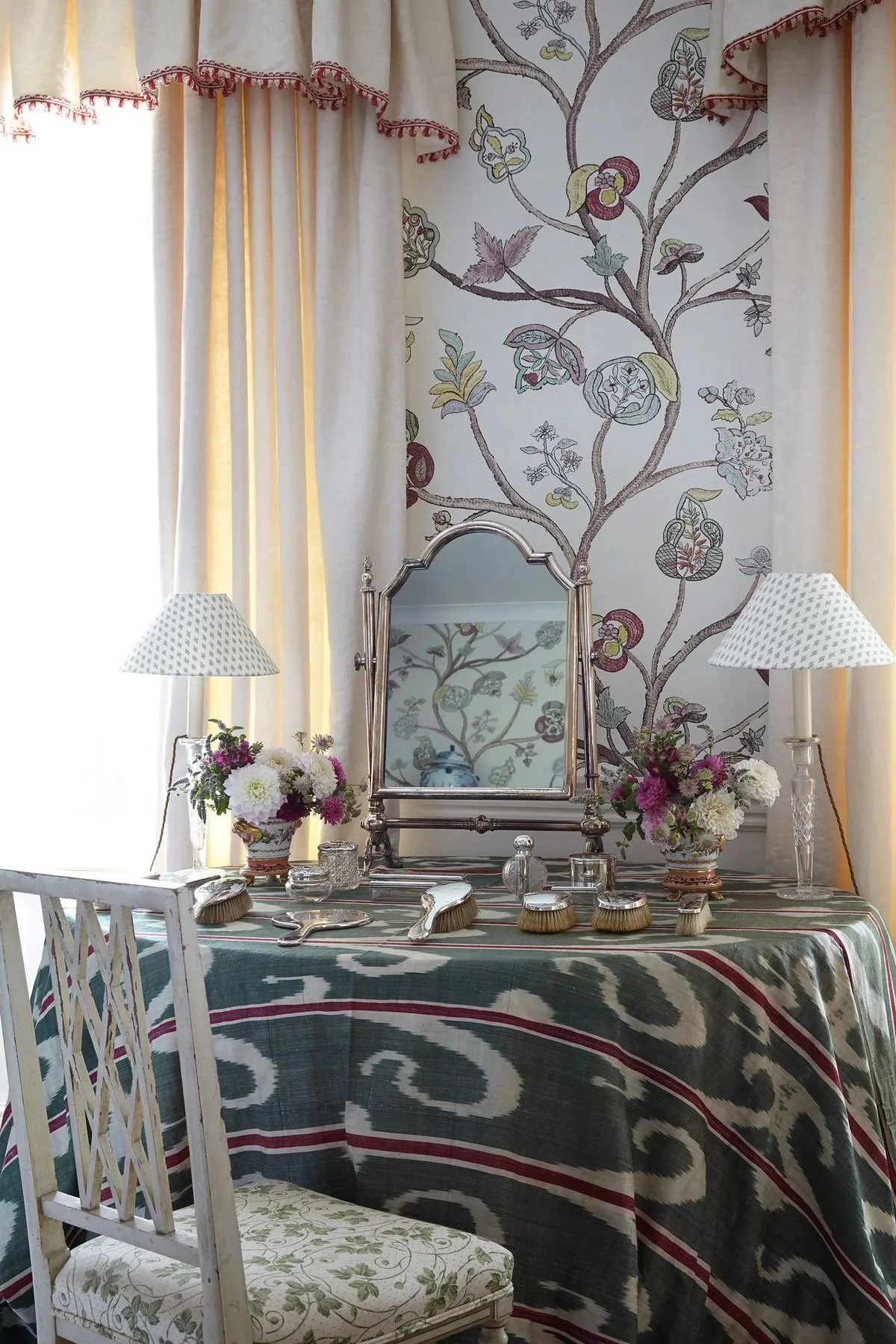
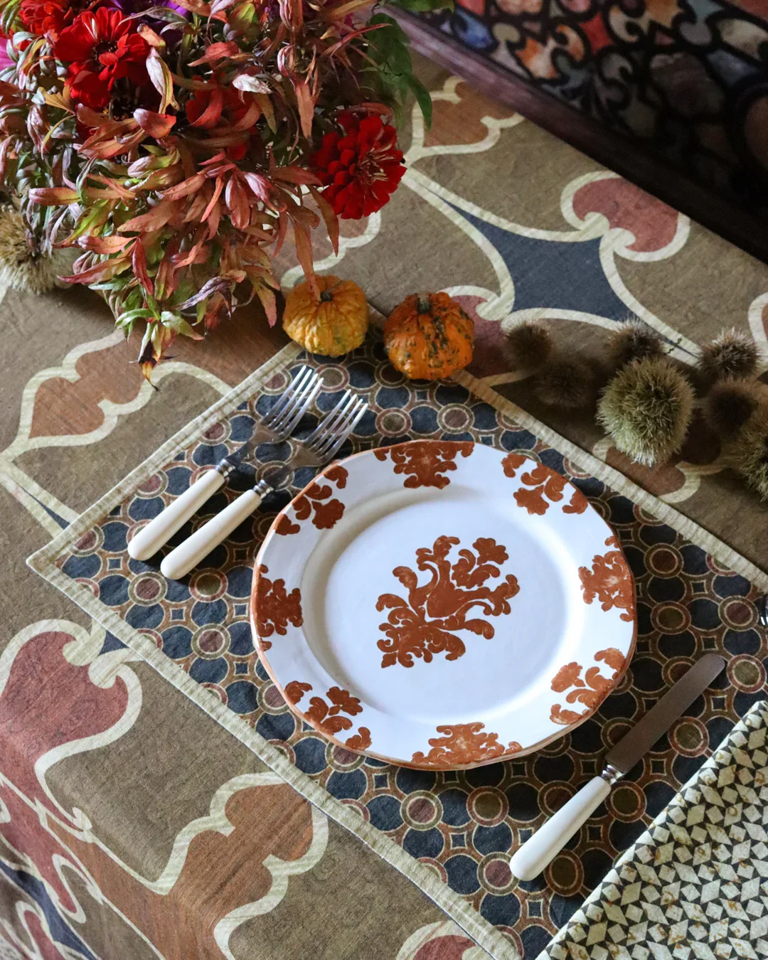
Table linens
Setting a table with a mix of patterns is the least committal way to experiment with pattern. You only have to live with it for the duration of the meal and can re-mix the patterns in different combinations for the next one. Also, there are so many options for pattern when setting a table including plates (dinner plates and salad/dessert plates), serving dishes, tablecloth, napkins, and table accessories like vases. As you’re investing in dinnerware and linens with pattern, you’ll want to use the same principles of scale, shape, and color; that way you’ll be able to mix them in a variety of ways. For more inspiration and specific combos, check out my styling guides to tables.
Cabana Magazine
Common Mistakes & How to Avoid Them
Avoid too many competing "statement" patterns. Think of a bold, statement pattern as the hero and layer it with supporting patterns in medium and small scales.
Forgetting about color. Establish a limited color palette (2-3 colors) and ensure all patterns share at least one or two colors to create cohesion rather than chaos.
Avoid using multiple patterns of the exact same size which creates a messy look. Be sure to vary the scale — including the density and width of the patterns.
Avoid too many competing, vibrant colors. Settle on a color palette that has a balance of colors with some vibrant, some subdued or neutral.
Not enough solids. You don’t want every part to be covered in pattern. Aim for roughly 40-50% of the surface area on the patterns to be solid.
Too much busy decor in the rest of the space. Unless you’re going for a maximalist look, keeping everything else simple and classic helps to balance out the pattern. Vintage/antique furniture can also help ground patterns.
Real Examples from My Home
Throw pillows on my living room sofa
I’ve used throw pillows to give a new look to my white slipcovered sofa and add character to the room in general. The sofa is below a tapestry with a wide range of colors, and I decided to isolate blue and red as the dominant colors for the pattern grouping. A small scale print in blue by GP Baker. A ticking stripe in blue/red by Robert Kime and a red ikat are the medium scale prints. Finally, a suzani with X serves as the large scale print and helps to blend them all together.

My bedroom accents
In my bedroom I drew pattern inspiration from an accent throw pillow covered in a medium scale Kathryn Ireland Tatiana print I impulsively purchased (I literally saw it in a store window and walked in and bought it). I picked up on the teal blue for the curtains in small scale block print I hung behind my bed, to simulate a headboard. I found a small striped bedskirt in almost the exact same colors as the pillow. As a finishing accent, I added a pink Welsh blanket in a large scale print. It took me longer to find, but eventually I layered in a rug in a wide pattern that picks up on the colors in the pillow and includes a lot of solid space to counterbalance all the denser pattern.

Dining nook
My dining area is a part of the same room as the living room so I used pattern to help delineate it as a separate space. I choose small scale block print curtains in blue/X/X to frame the window behind the table. Under the table is a kilim rug – the reason it works is because the scale is much larger than the print of the curtains. The table is painted in an earthy red, picking up on the color in the kilim, which helps to ground it in the space and prevents it from looking too chaotic. I painted the chairs in the blue picked out of the rug which helps it blend in You can read about how I transformed the IKEA table and used decorative paint on the IKEA chairs.
